Photos by: @mstudioofficial
© MEHRDAN
“Bad: An Exhibition about the Exhibition” is an exhibition about products that, according to the manufacturer, could not be presented until today for various reasons.
This exhibition shows bad productions, but it does not necessarily claim to have offered them in a bad way.
The current exhibition is bad. Because it does not adopt a specific point of view, the producer constantly twists and turns, and his artistic expression is not coherent.
None of the products in this exhibition will be signed by the manufacturer or provider. You can buy the signature separately and install it on the work or whatever you wish. You can also forge this signature by watching the signature forgery video shown in the exhibition.
Needless to say, it does not matter whether such an exhibition has been held before or not. If such is the case, consider this exhibition a tribute to the previous ones.
Meanwhile, please don’t forgive the badness of this exhibition out of your benevolence.
Elements of a Bad Exhibition
Statements:
What should a bad text or image look like? Should a bad text be bad in itself? Or should it be bad in the worst possible way? If a text is badly bad, it must be good in something, and having considered specific criteria; it can be reflected as something good. If it’s bad in its badness, with a bit of distance from its general conformation, it can again be assumed good. If something is supposed to be bad, will there be a specific criterion that should be satisfied or a criterion that should not be satisfied? Is the will to reach or not to reach a bad goal the true aspiration behind being bad? Furthermore, the badness of a text can be, in turn, determined by the failure, disappointment, and fiasco of getting a specific purpose or criterion.
- This exhibition is full of fluff.
- This exhibition is undecided and confused.
- This exhibition does not stay true to its own logic.
- This exhibition is conservative.
- This exhibition is too scattered and incoherent.
- This exhibition suffers from a kind of excessive selectivity.
- This exhibition does not take itself seriously.
- This exhibition takes itself too seriously.
- This exhibition has some kind of unnecessary co-occurrence.
- This exhibition is contradictory.This exhibition intends to follow several types of narratives simultaneously, and these several types intersect at some points. As you can see, it did not succeed.
- This exhibition is also like any other text, which, taking into account the placement of that text in its subtexts, with the leakage of meaning from the context to the text, will eventually suffer a contradiction somewhere.
- This exhibition will change daily during these two weeks.
CV
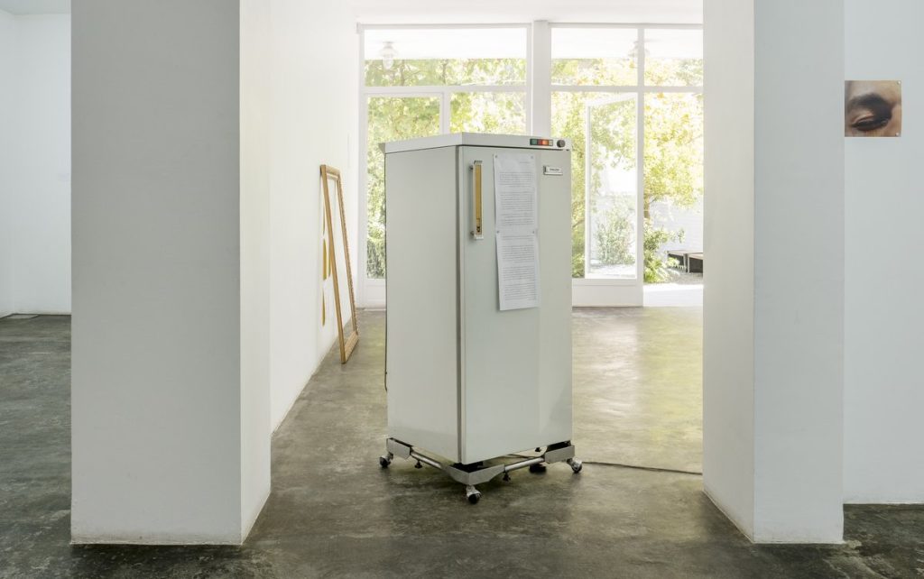
Freezer

Traces:
One:
Each scar is a mark that proves a strong object has once collided with a soft surface.
Two:
Wounds scratch, crack, and split the skin. They turn an integrated and healthy whole into a defective one.
Three:
A certain part of the body seldom gets wounded more than once.
Four:
You will unlikely find a body with no scratches or wounds on it.
Five:
Nobody is completely healthy. Being flawless, being completely healthy is not normal. Because nothing is as natural as a scar, and nobody is without scars.
Six:
Wounds leave marks on the body. They flag the body. They are usually accompanied by memory and pain. Wounds heal, pain is forgotten, and only scars remain. A scar is nothing but a reminder or a warning. Watching a scar is the same as re-reading history.
Seven:
Any strong structure breaks apart as the cracks deepen. That is why the gaps are always repaired and hidden.
Eight:
No wound is fully healed unless it bears a surplus: a welding residue, a bit of plaster, an adhesive patch, a raised scar, or signs of inept repair.
Nine:
The purpose of writing the text on this frame is to examine the frame critically. Like the other text-images in this exhibition, this text-image claims to represent a kind of documentary demonstrating and hiding wounds—a documentary from a documentary. Though not only can’t he do that, he can’t even assert his claim properly because we don’t see anything from the process of producing this image. This photo takes a heavily manipulated image of a hand to represent the whole history, turning it into a model of history. This image cannot show the relationship it claims – the relationship between a part of the body with history and the wound with historical catastrophes. This image tries to take the body as history, the wound as a historical catastrophe, and the inept repairing using the software as a distortion of history.
But first of all, the relation of the person who documented the image and manipulated it is not the same as the relation between the cause of the historical catastrophe and the person who distorted it. Secondly, if this image is supposed to represent historical and collective wounds, there should be a difference in the scars. For example, these images do not distinguish between war, coup d’etat, or terror.
It is unknown why the producer of this text-image put this text on the photo itself. While reading and seeing the present text-image does not add anything to individually reading–and–seeing the text and the image. The current frame’s text has some unnecessary synchronicity.
This frame is significantly different from other frames: High color saturation and repetition of a single wound instead of retouching and hiding it. This difference causes this frame to be completely different from the series in which it is placed. And the reason behind it is not clear to the audience. At least if one of these differences was repeated in another photo and the reason was mentioned, the audience would have faced a certain variety of expressions. At least they could imagine a correspondence in history and distortion of history by examining this model.
To the audience, except for the visual aesthetic aspect, reading the sentences on the image will not be much different from reading this image and the text separately.
In other words, the only difference between simultaneous reading–and–seeing this frame and its separate reading–and–seeing is in the suggestion of encountering the two simultaneously, which is probably impossible.
But the badness of the text of this frame, the text you were reading until the previous sentence, is the bad way it uses to criticize its background image. Some of the writer’s flaws regarding this text-image are due to a half-hearted reading of the entire work. It also expects from this text-image what the text-image itself has not claimed to possess. The text examines the image elsewhere, separately from the text written on it and vice versa. It also separates the text you are reading from other frames in the same pack. For example, most of what was raised as the problem was repeated in every frame. It makes no need to mention these problems while they are frequently repeated. Instead, he could deal with the distinctions of this frame with the other frames.
The text you are reading cannot succeed in critiquing this frame because it does not consider this text as part of the whole of which it is a part. In other words, this text cannot fully cope with its context. Besides, the writer of this text does not consider himself the producer of the text-image. And he does not fix the faults he brings to it, as if someone else had written these lines. While he can go back and revise the work, he deprives himself of this opportunity.
The problem is that he presents his thinking process, not his reasoning process. He records his self-talk, not the result of this conversation. The writer of this text tries to criticize this frame, but not only is this frame not suitable for this work, but by doing so, he damages the whole. Apart from the inconsistency of this frame with the whole, the most important criticism that can be mentioned for this text-image is its inability to criticize itself.
Frames:
Frames:
This collection was a part of the practical work of my bachelor’s thesis. It was supposed to complement the thesis text. The thesis text was about mechanisms in capitalist societies that control image dissemination plans. These mechanisms include:
- Censorship.
- Interventions in the book publishing industry
- Excess supply of lousy and feeble images
In this series, a single photo is presented in different ways. Each of the frames displays one of the control mechanisms.
Why is it bad?
This series is bad, not because every one of these frames is bad, nor because they are too evident. Rather, it is bad because it is part of a collection, the main part of which is a text that is so bad that I am ashamed to read it again. I have to eradicate it one day anyway.
Secondly, this series cannot make a photographic equivalent for the mentioned mechanisms. This series tries to take the photo as the reality and the frames as access control mechanisms. In contrast, the photo represents a reality outside of itself. Although the photo is a reality, it is an image of another reality, and these two cannot be assumed to be identical.
In addition, these frames did not complete the text but only tried to repeat it in another form.
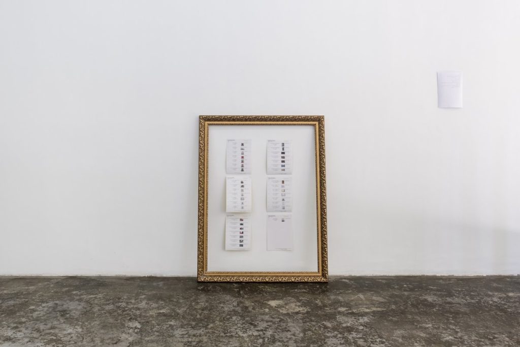
Price List:


